case study

Design system for an enterprise SaaS platform

Enterprise HR software platform

Designing and building a production-grade component library that unified a multi-module enterprise product

Design system·AI-Accelerated Product Engineering·HR Technology / SaaS·April 2023

Client identity and commercially sensitive detail are withheld under the confidentiality terms of this engagement.

Challenge

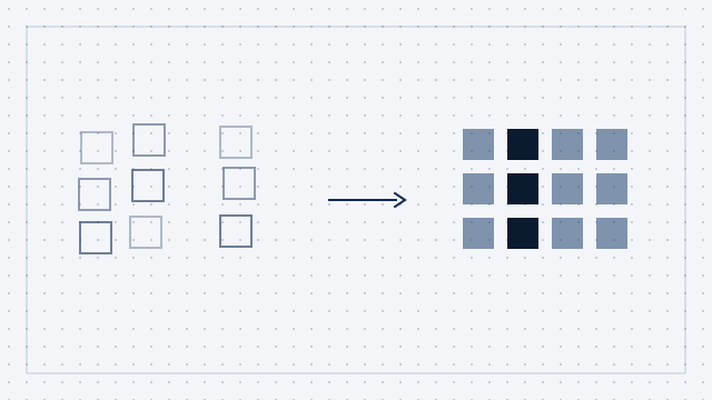
Challenge Our client operates an end-to-end HR platform that had grown, over many years, from a single-purpose tool into a suite spanning recruitment, onboarding, payroll, learning, performance, rostering, and analytics. That growth was commercially successful and had left a familiar mark on the product: significant visual and behavioural inconsistency across the surface. Each module had been built by a different team in a different period. The result was a fragmented experience - different button styles, inconsistent spacing, varying form patterns, and accessibility standards that ranged widely from module to module. With a large engineering organisation building across the platform simultaneously, there was no single source of truth for how a component should look or behave. Design and engineering worked from different references. Every new feature meant re-litigating UI decisions that had already been made, differently, somewhere else in the product. The existing styled component library had evolved organically and served its immediate purpose, but lacked the foundations a modern design system needs: design tokens, documented usage patterns, accessibility standards, a theming architecture for white-label customisation, and documentation that made adoption frictionless. As product ambitions grew - including deeper white-label support for enterprise customers wanting their own branding - the gap between what existed and what was needed became a hard constraint on velocity.

Approach

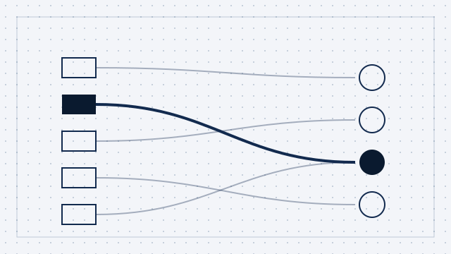
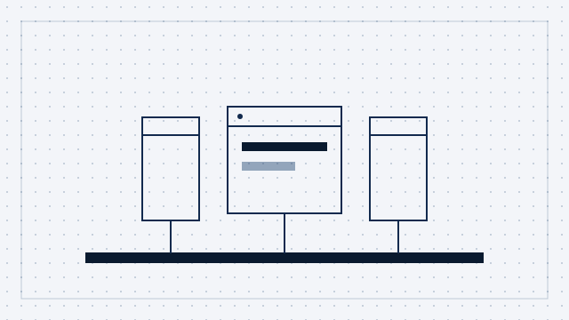
Approach We began with foundations rather than components. A design system built on poorly defined foundations - inconsistent spacing scales, ad-hoc colour tokens, unsystematised typography - reproduces exactly the inconsistency it was meant to solve. Before a single component was built, we established the design language: a complete token set covering colour, typography, spacing, border radius, shadow, and motion, defined as the single source of truth for both the design library and the code. The technology decisions were made with a large existing engineering organisation in mind. The library had to be immediately adoptable by developers already working in React. TypeScript was non-negotiable - type safety at the component API level is the mechanism by which a design system enforces correct usage at scale. We chose Emotion for styling: CSS-in-JS with strong TypeScript support and a theming architecture that could carry white-label requirements without leaking implementation details into consumer components. Accessibility was a first-class requirement, not a post-launch audit item. Every component was built against WCAG 2.1 AA from the first line of code - keyboard navigation, screen reader compatibility, focus management, colour contrast. That was a deliberate architectural choice: accessibility built into the primitives is inherited by every product team that consumes them, without those teams having to make accessibility decisions themselves. The documentation site was treated as a product in its own right. A component library teams do not understand is a component library teams do not adopt. Built on Next.js, it carried live-editable code examples, automatically generated prop API specifications, usage guidelines, do/don't examples, and accessibility notes for every component. Adoption required no tribal knowledge.

Solution

Solution We designed and delivered the complete design system: Design language foundations - a full token system covering colour palette, typography scale, spacing, border radius, elevation, and motion curves. Tokens defined once as the single source of truth, so a change propagates across both the design library and the component library. React component library - a comprehensive set of production-grade components in React, TypeScript, and Emotion, covering every core pattern across the product suite: layout primitives, navigation, forms (inputs, selects, checkboxes, radios, date pickers), data display (tables, cards, badges, tags), feedback (alerts, toasts, modals, drawers), and data visualisation wrappers. Every component typed with explicit prop interfaces, keyboard navigable, screen reader compatible, WCAG 2.1 AA compliant, and theme-aware. White-label theming architecture - a theming layer letting enterprise customers apply their own branding without touching component internals. Brand colours, logo assets, and typography preferences configured through a theme object that overrides the default tokens at the provider level. Documentation site - a Next.js site with live code examples in a sandboxed rendering environment, prop tables generated automatically from TypeScript definitions, usage guidelines, accessibility notes, and contribution guidelines. It is the onboarding surface for every developer adopting the system, designed so that using a component for the first time takes minutes rather than hours. Adoption support - structured onboarding for the product teams: presentations to the engineering and design organisations, a dedicated support channel, video walkthroughs by component category, and a defined contribution process for teams wanting to extend the system.
Results

Results The design system became the foundation for new feature development across the product suite. The engineering organisation adopted a single component library as its UI source of truth, eliminating the per-feature reinvention that had been consuming engineering time and producing inconsistency. The white-label theming architecture let the business offer branded product experiences to enterprise customers without per-customer engineering work. The accessibility-first architecture brought WCAG 2.1 AA compliance to every surface that adopted the system, without individual teams having to run their own accessibility programs. The work was recognised internally with an engineering excellence award voted by the client's own engineering organisation. What this engagement demonstrates: we can build design system infrastructure that a large, distributed engineering organisation will actually adopt - because the foundations, the accessibility, and the documentation are treated as the product, not as trailing work.

Technologies

React(Frontend)TypeScript(Frontend)Emotion (CSS-in-JS)(Frontend)Next.js (documentation site)(Frontend)Design tokens (colour, typography, spacing, motion)(Design)WCAG 2.1 AA accessibility(Frontend)White-label theming architecture(Frontend)Figma component library(Design)Storybook(Frontend)Automated prop API generation(Frontend)Live code sandbox documentation(Frontend)

Ready to reach escape velocity?

Let's talk about your product.

Contact us